This is a simple sketch of my idea to refine the current Windows 10 icon style. The latest icon design (from Build 10125) is a little bit better than previous builds, but still very ugly.
You can see all the official new icons in reports such as: A closer look at the new Windows 10 icons on Build 10125
Now, Let's look at my plan.
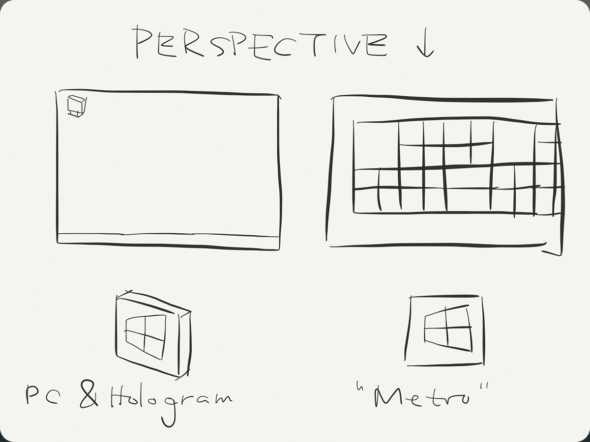
Windows 10 have at least 6 versions covering different devices like PC, laptop, tablet, phone, Holograms, cars and so on. We've already met "Metro" (or "Modern") design of icons for tablets and phones. They've influenced Windows 10 icons for PC. A lot of new icons are made in an 2D perspective.
I think the icons made for PC display must be in 3D, not 2D. Meanwhile, for the same app, its icon for "Metro" interface should keep in 2D style. Developers should design 2 sets of icons, one for PC and Hologram, the other for tablet and phone.
Since most of legacy applications have 3D icons (when they developed with Windows 7, XP or Vista), an interface combined with both 3D and 2D icons will be a total mess. Just like the shot below:
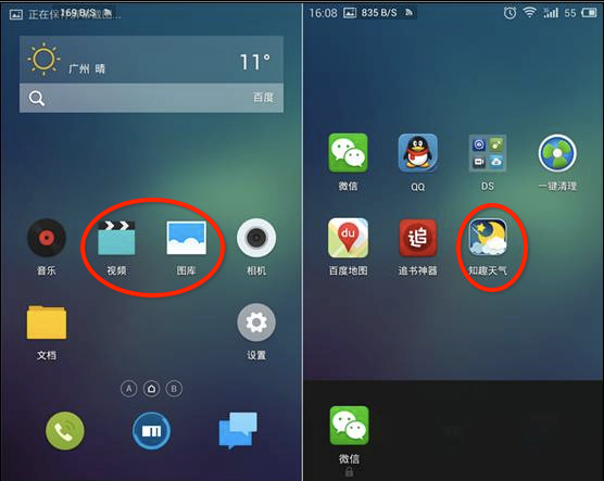
Screenshot from Meizu's Flyme OS. Chinese companies like Xiaomi, Meizu, Smartisan, etc. made various modified Android ROMs, the biggest difference among them is the customized icons. But they can't redraw every app's icon, so there's always some icons with different style. The overall result is weird.
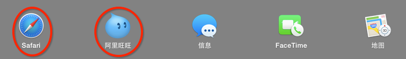
Mac OS X Yosemite's revamp introduced some new icon design, they noticed the problem - compatibility with legacy icons. Therefore they made the flat icons in iOS somehow look like "stickers". They look well together with other icons.

1. This PC
I think "this PC" should be replaced by "this device". And also, when Windows is installed in different kinds of devices, its icon may show the corresponding device.
Let's see what'll be shown in a PC. The left side is the icon for PC display, the right side is for Metro UI.

2. Recycle Bin
The edges of the dustbin should be round corner instead of square corner. Round corner design is introduced since Windows 2000.

Also, the recycle sign inside is too thick. It should be thinner like the "X" icon above.
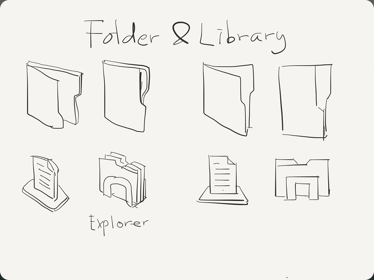
3. Folders & Library
Folder logo should strictly follow the rule that use 45° angle for PC and use front view for Metro UI.

Current design mixed folder icons in different direction so it is confusing.
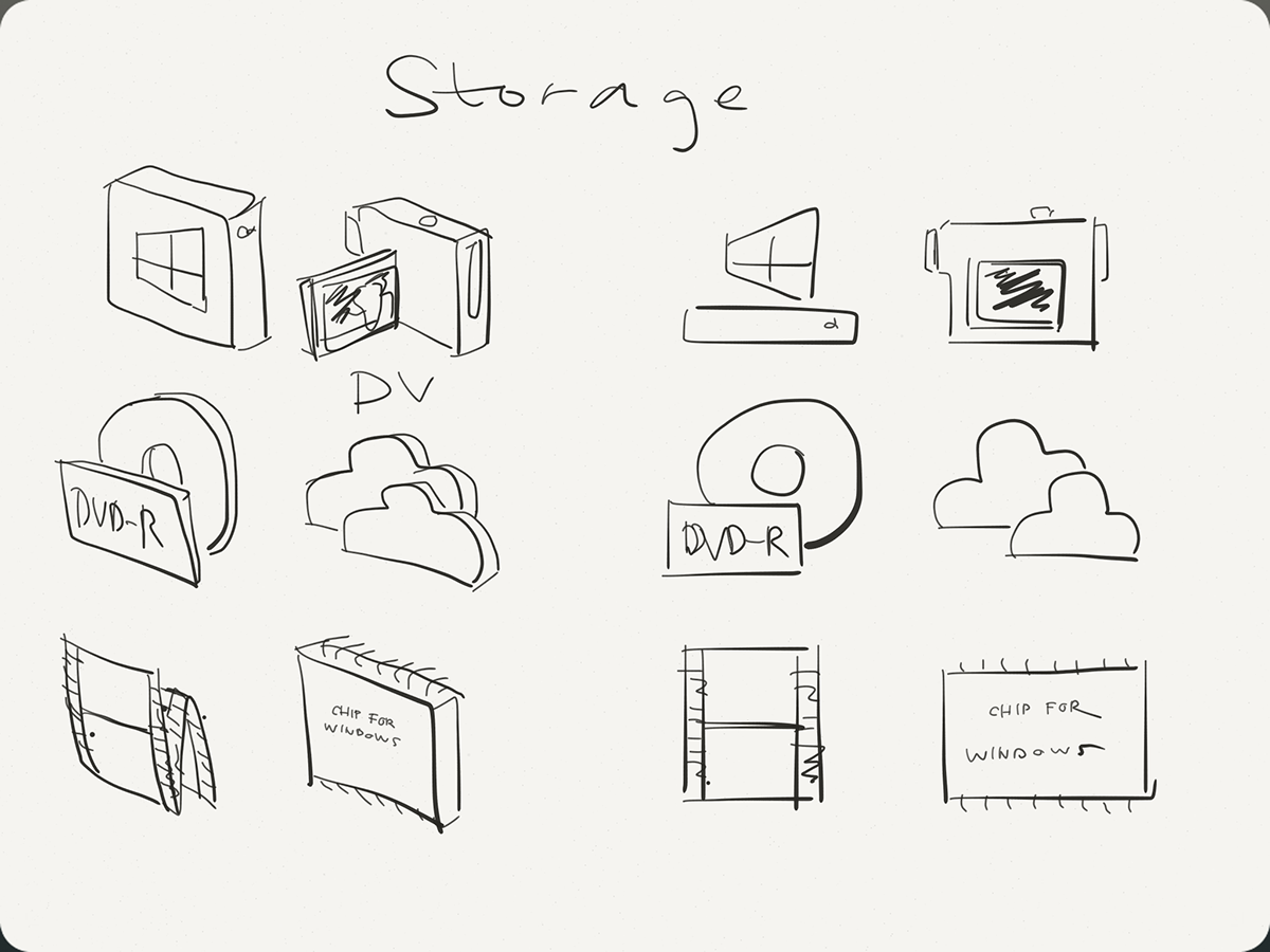
4. Storage devices
All icons should have both front view and side view.
When video icon (in front view) and drive icon (in 45° angle) come together, something went wrong.

5. Control Panel
All the elements look like "cardboards" when turned into 3D.

This "rename" icon is in 2D. However, it's displayed as a button in the Explorer ribbon area. Therefore its size is smaller than default. In this condition we should use the "metro"version of this icon, instead of using "PC" edition. Otherwise it may go blur and hard to identify.

6. Warning Signs
Remember they are "cardboards", not sheilds and balls.
If you tried to make them 3D Shields and balls, they may not turn to 45° angle.
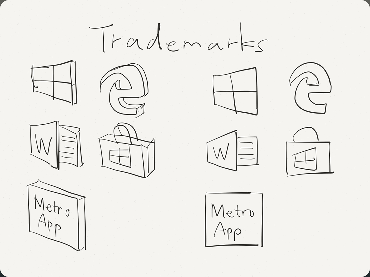
7.Trademarks
As shown in the sketch, the Windows store icon is currently in a side view even in "metro" style. It should be a shopping bag in front view when drawing its "metro" icon. Similar to the Office components' icons.

For 3rd party "metro" apps, their icons should be processed like this Hologram image above. Make the whole tile a "cardboard".
-END-
This concept is first written in Chinese and published at cnBeta.com

